OPA TAVERNA REBRAND
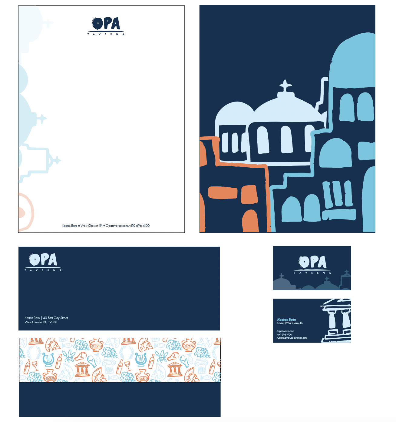
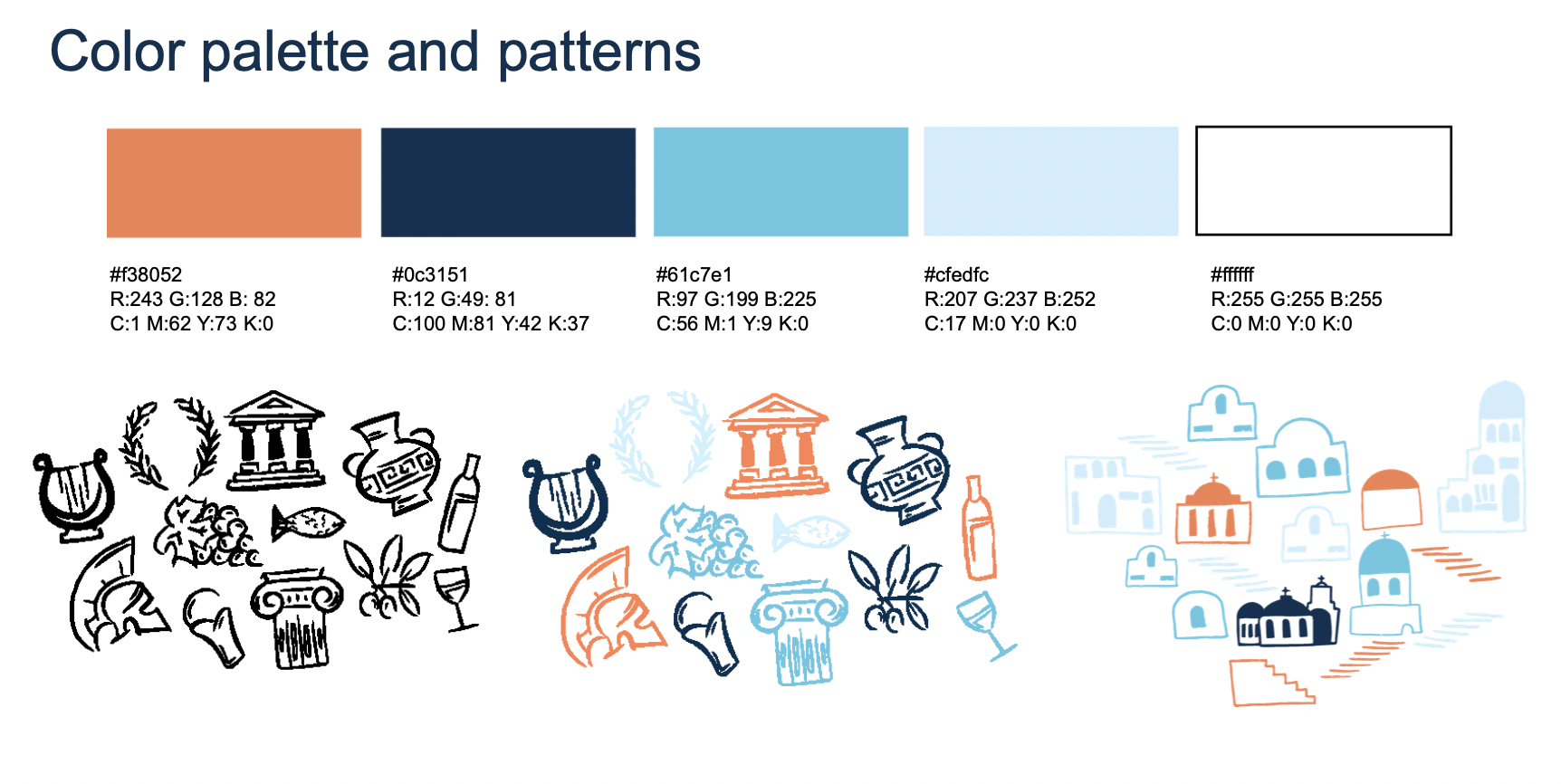
Part of my internship project was to challenge myself in rebranding a small business that was lacking an overall aesthetic. My goal was to create stronger visuals for the audience and bring back a cohesion around the Greek culture that represents Opa Taverna. All header type was hand-done typography and all visuals are illustrated through procreate and modified into vectors through illustrator. Additional imagery created was hand done and modified in photoshop along with all layouts were created in Indesign, as well as any animations were done in after effects. To keep the aesthetic of Greek culture, I kept the color palette to a minimum of a blues and a pop of orange to represent the popular sunsets of Santorini. Throughout the rebrand, a series of buildings are present on the menu and stationary that also ties into the islands of Greece.


-
![]()
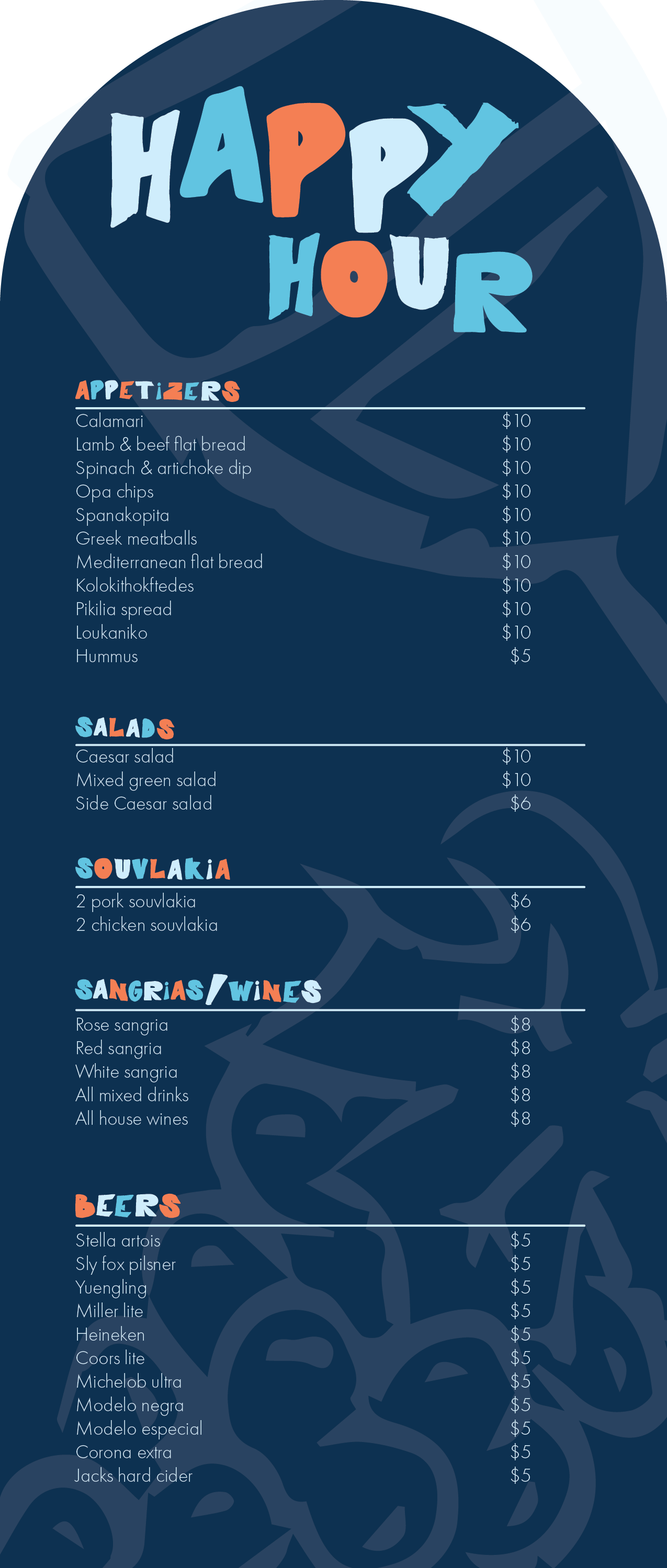
Happy hour close up
-
![]()
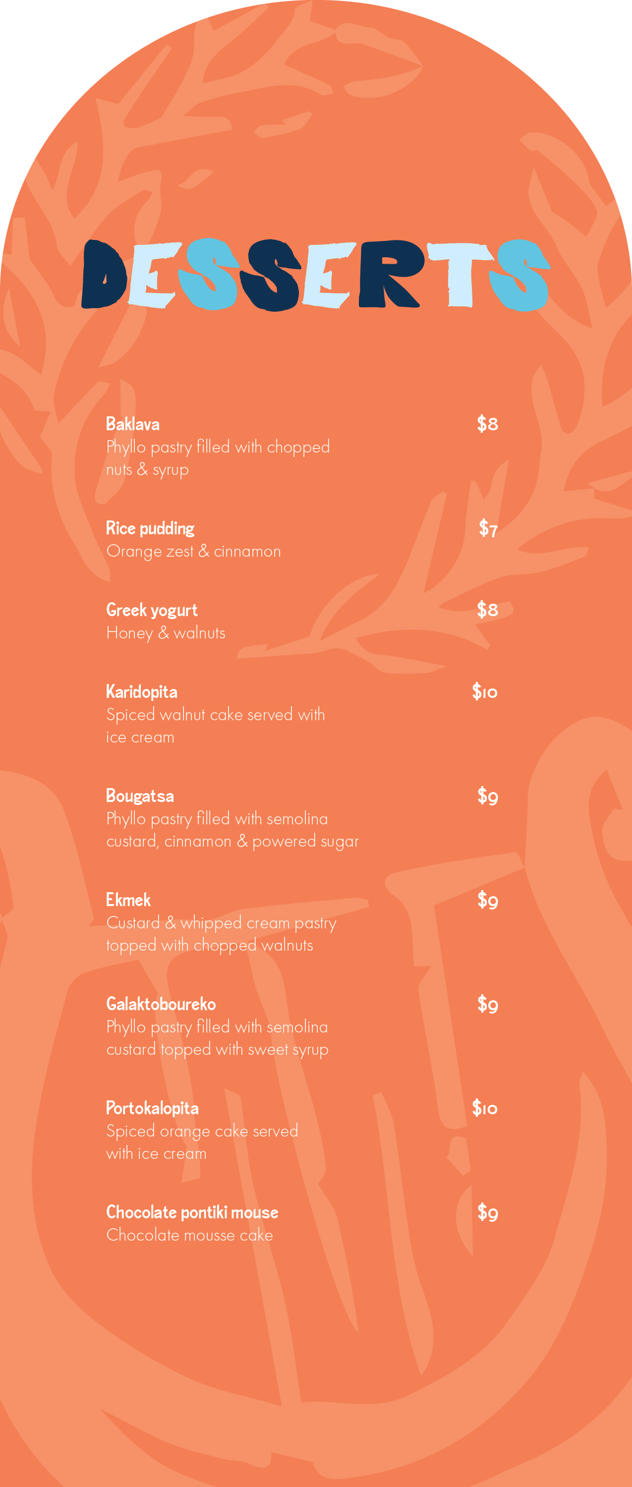
Dessert Close up
-
![]()
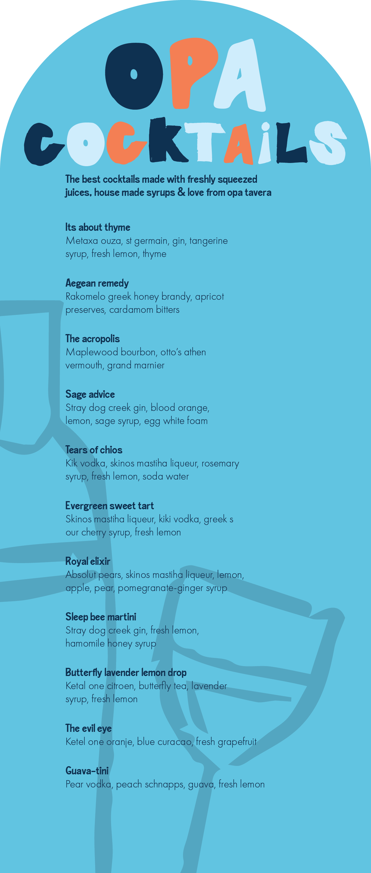
New List Item
-
![]()
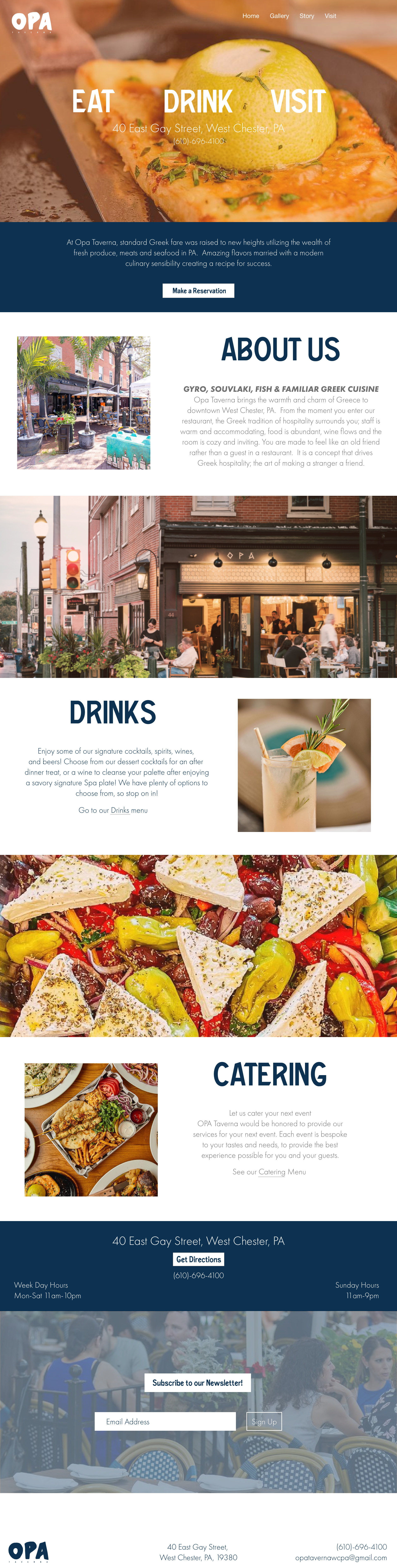
website
-
![]()
Letterheads
-
![]()
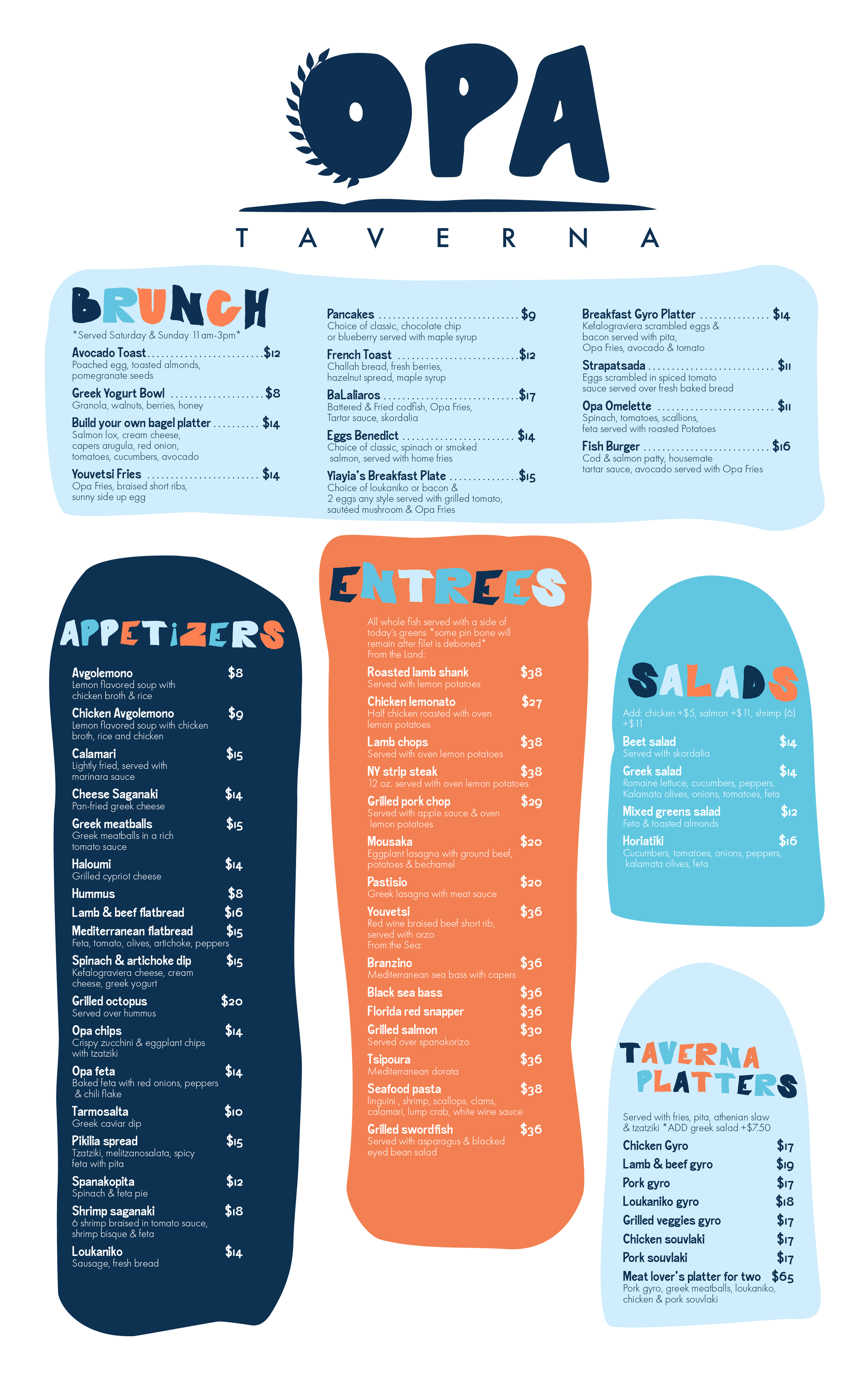
Main menu
-
![]()
main menu
-
![]()
guidelines
-
![]()
guidelines cont.
-
![]()
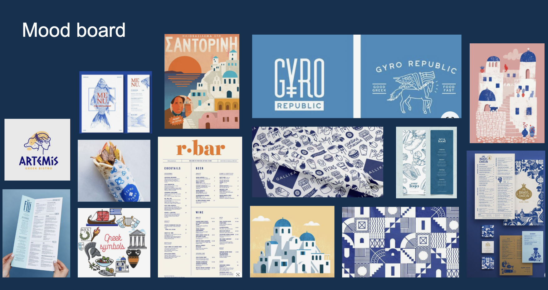
moldboard
-
![]()
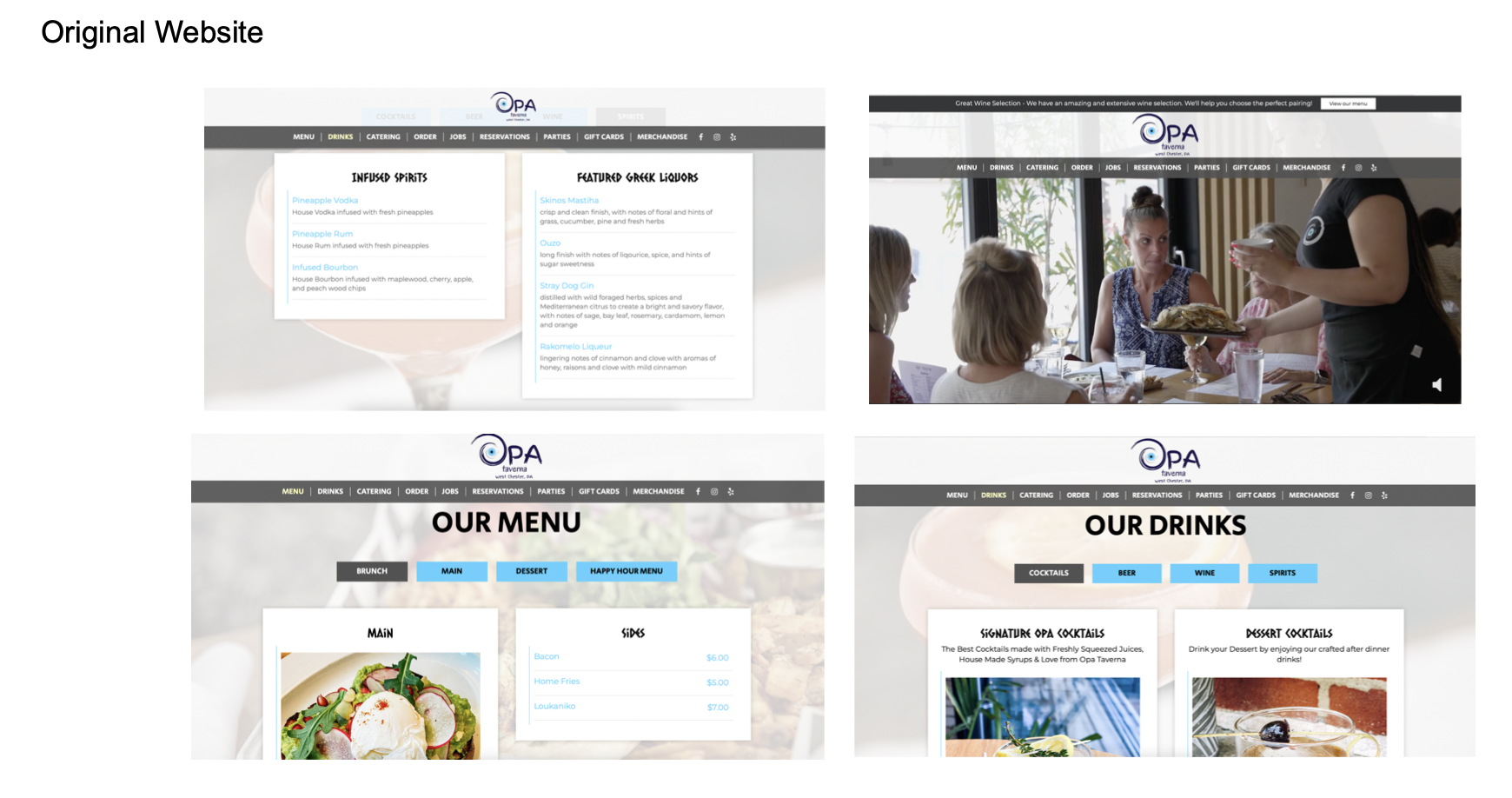
original website